
Conditional formatting in Excel is a powerful way to make your data visually appealing and easier to analyze. It allows you to automatically format cells based on specific rules, helping you spot trends, patterns, and anomalies in your data instantly. In this guide, we’ll show you how to use conditional formatting effectively for data analysis.
What Is Conditional Formatting in Excel?
Conditional formatting is a feature in Excel that changes the appearance of cells based on the values they contain or certain criteria you set. For example:
- Highlight numbers above a threshold in green
- Mark overdue tasks with a red flag
- Apply a color gradient to show trends
This feature is especially useful when working with large datasets because it helps you quickly visualize the most important insights without manually scanning each cell.
Why Use Conditional Formatting for Data Analysis?
When analyzing data, it’s easy to get lost in rows and columns of numbers. Conditional formatting helps by:
- Highlighting trends and patterns visually
- Identifying high or low values quickly
- Spotting anomalies or errors in data
- Making reports and dashboards more engaging
For instance, in a sales dataset, conditional formatting can instantly highlight top-performing months or underperforming products.
How to Apply Conditional Formatting in Excel
Applying conditional formatting is straightforward. Follow these steps:
Step 1: Select the Data
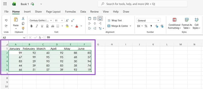
Open your Excel spreadsheet and highlight the cells you want to format.
Step 2: Open Conditional Formatting
Go to the Home tab on the ribbon and click on the Conditional Formatting button.
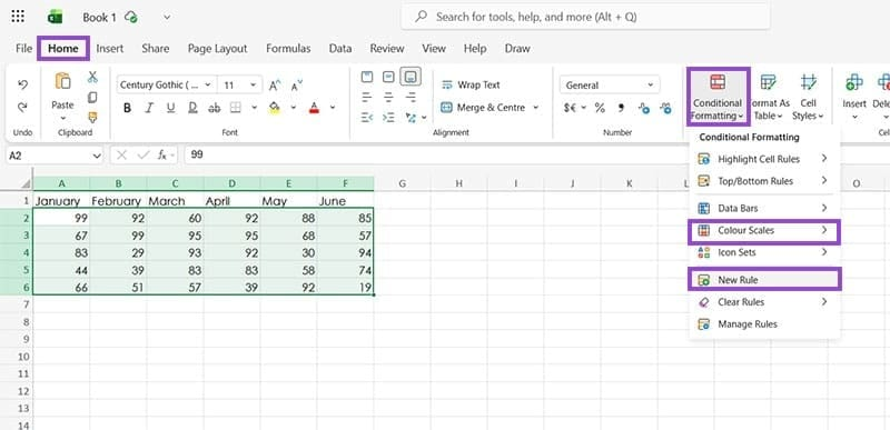
Step 3: Choose a Rule
You can select from preset rules or create a custom rule:
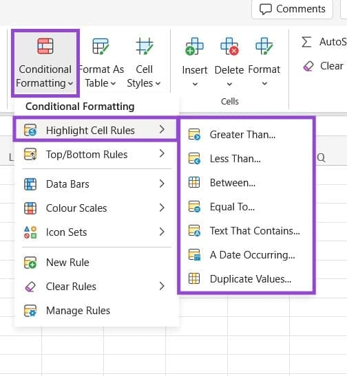
- Highlight Cell Rules – Format cells based on value ranges, text, or dates.
- Top/Bottom Rules – Highlight top or bottom values, or those above/below average.
- Data Bars – Add horizontal bars to show relative values visually.
- Color Scales – Apply a gradient of colors, like a heatmap, to show high and low values.
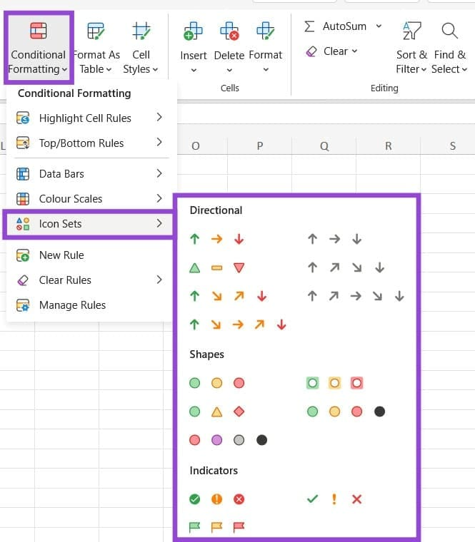
- Icon Sets – Add icons like arrows, checkmarks, or flags to indicate performance.
For example, a Color Scale can make higher numbers green and lower numbers red, giving you an instant visual summary.
Types of Conditional Formatting Rules
Here’s a closer look at the most commonly used conditional formatting options:
1. Highlight Cell Rules
Use this to emphasize important values. You can highlight cells that are greater than, less than, equal to, or between specific values. It also works for text or dates.
2. Top/Bottom Rules
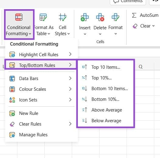
Quickly identify the top or bottom performers in your data. For example, highlight the top 10 sales figures or any values above the average.
3. Data Bars
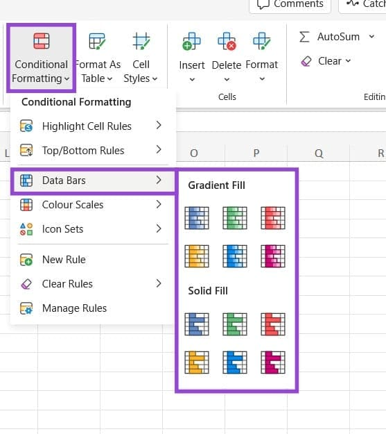
Visualize numbers with horizontal bars. Longer bars indicate higher values, while shorter bars indicate lower values. This is great for comparing data at a glance.
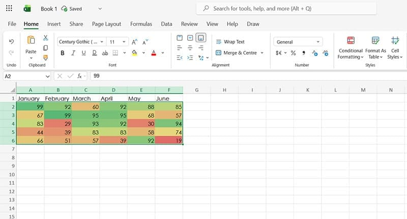
4. Color Scales
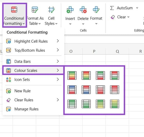
Turn your dataset into a heatmap. Cells are shaded with a gradient, helping you instantly spot trends, patterns, and outliers.
5. Icon Sets
Use icons to represent data visually. Arrows can show increasing or decreasing trends, while symbols like checkmarks or crosses can indicate status or completion.
Tips for Effective Conditional Formatting
- Keep it simple: Avoid overloading your sheet with too many colors or icons.
- Focus on insights: Highlight data that adds value to your analysis.
- Combine with Excel formulas: For advanced analysis, create custom formulas to trigger formatting based on complex conditions.
- Use consistently: Apply the same formatting rules across similar datasets for better readability.
Conclusion
Conditional formatting is a versatile tool for anyone working with Excel. Whether you are tracking sales, analyzing project deadlines, or monitoring performance, it can help you visualize key information quickly and clearly. By mastering this feature, you can make your Excel sheets both informative and visually appealing.